
PLUM CASCADE
PLUM CASCADE 8” x 8”
This was an exploration of ‘Warms and Cools’, ‘Transparency and Opacity’…..


TONAL SKETCH
This is where you do your thinking! The key to this painting - what makes it interesting, for me, is the way the light flows into the cut plum and the way the darks cascade down like a waterfall from top left to bottom right. A simple 3 tone sketch forces you to make those decisions up front - are the cut plums going to be a light or a midtone? or in this case one of each.
It’s done on the back of a cereal packet with a fine liner, a sharpie and some white acrylic paint. Note how the focal point (the lighter cut plum) sits exactly on the intersection of the thirds.
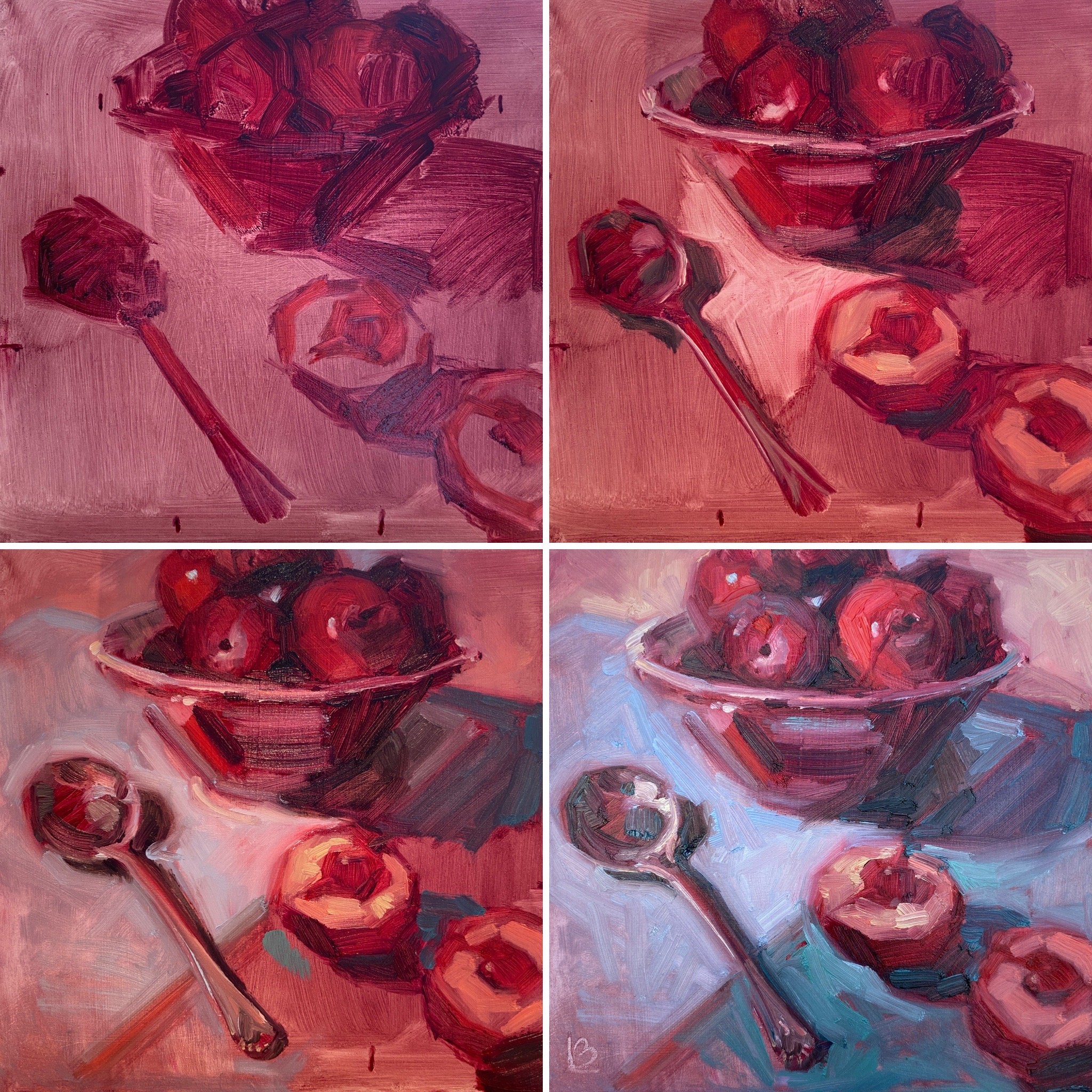
Underpainting in Alizarin Crimson & Raw Umber to plot out the tones. Cadmium red for the brighter flesh on the plums in the bowl then using the more opaque colours on the surface. Putting complimentary colours next to each other at the focal point, softening the edge where the light flows into the plum. Trying to reflect all the colours used in the painting in the silver spoon - a 10th Wedding Anniversary Gift from a friend. (It’s always lovely to have an item that has meaning to you in a still life.)

Using Yellow Ochre as my yellow stopped the oranges from being too saturated. Mixing with a palette Knife on a glass palette.