RENNIE MACKINTOSH STAINED GLASS WINDOW
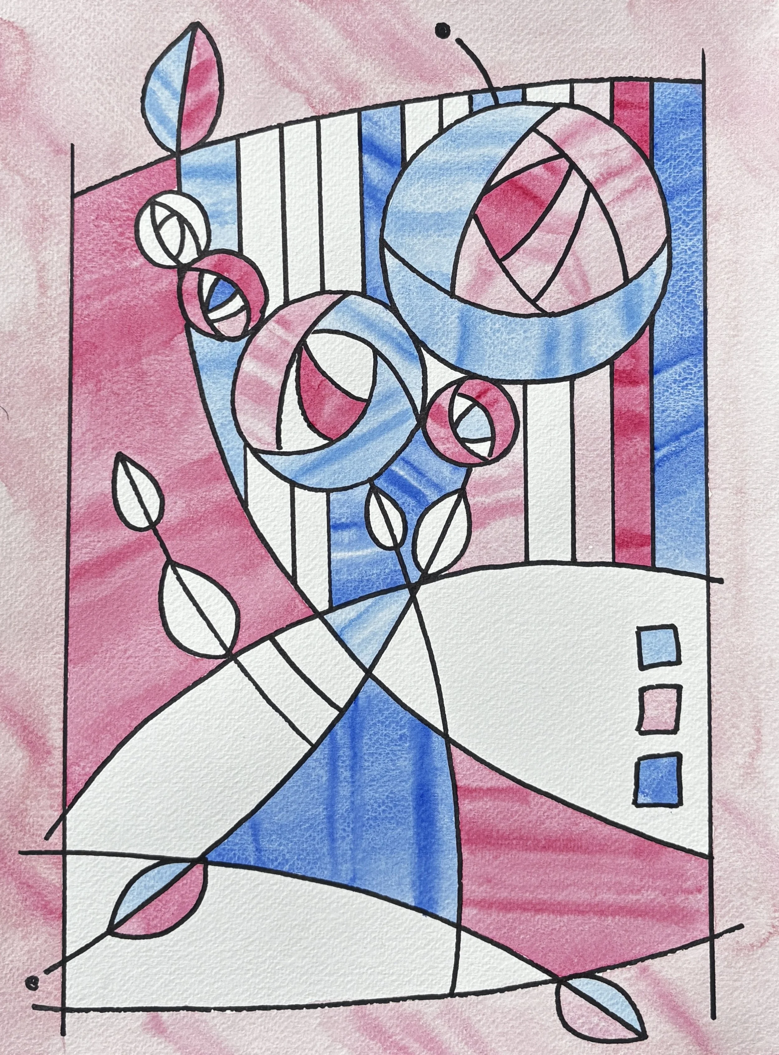
Stained Glass Design in the style of Rennie Mackintosh featuring his trademark “Rose’. Watercolour Paint & Ink on Watercolour Paper A3.
This was done in preparation for teaching a ‘Beginners Art Class at ‘Campion Art Studio’ and at ‘Micklems Farm Creative Workshops’. I look forward to seeing the student’s interpretations.
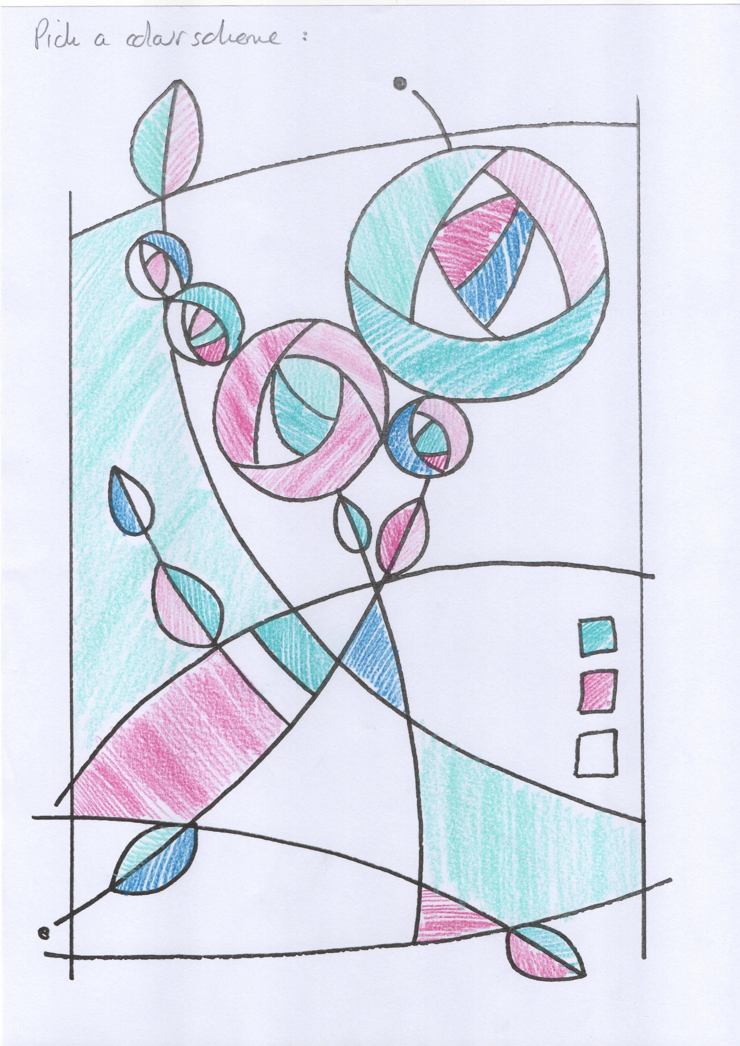
A. Try a colour scheme.
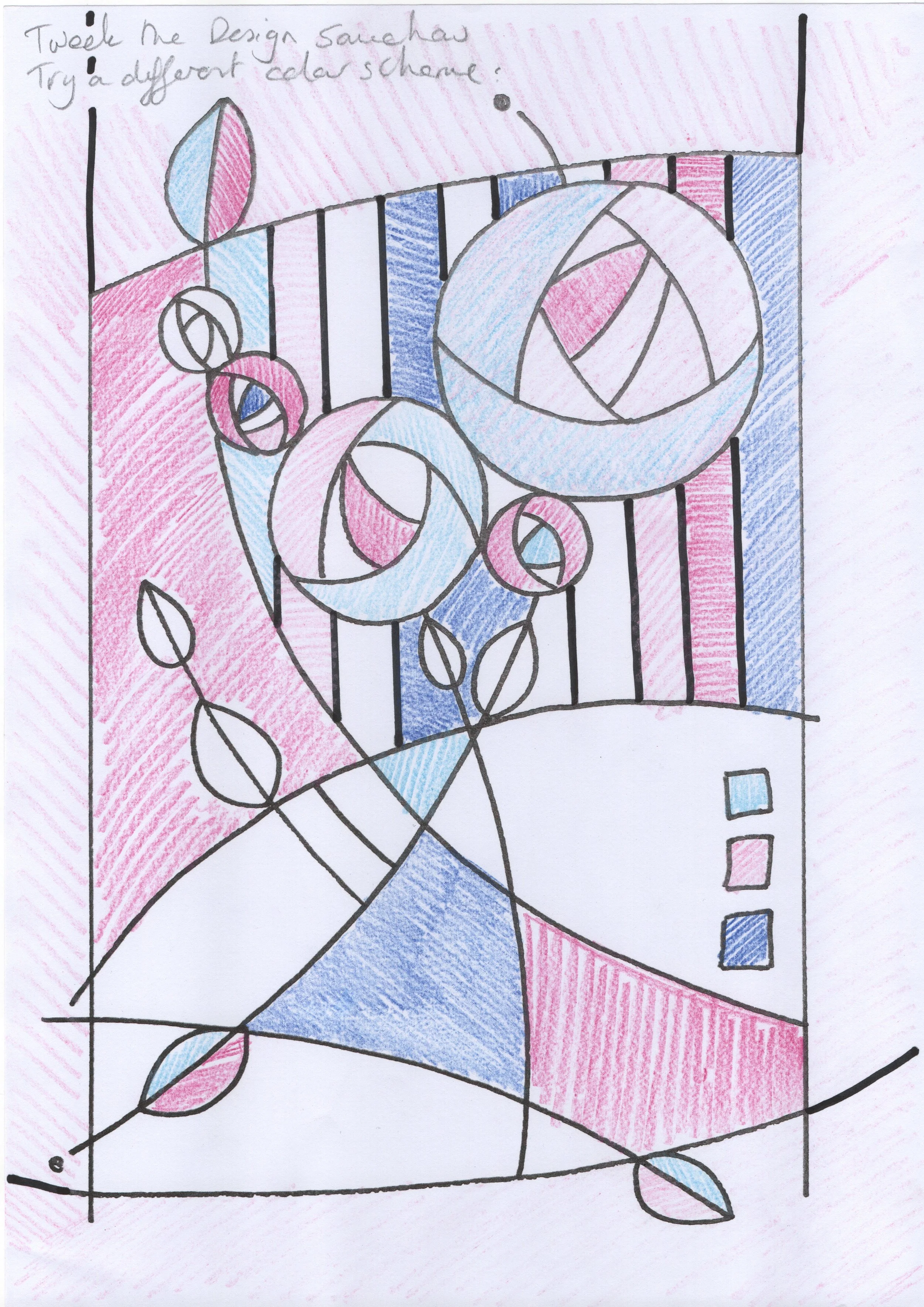
B. Tweak the design and colour scheme to personalise.
Watercolour paint is generally transparent. Whereas Gouache, which is similar to watercolour, is opaque.
What does this mean?
Transparent paints allow the white glow of the paper to shine through the paint, as a result the painted area looks like coloured glass might. Opaque paints however have the effect of looking at a plastered wall painted with emulsion. You can’t see through it.
While some opaque paints are mixed with white pigment to block out light, many colors are naturally opaque. Opacity depends entirely on the chemical structure of the pigment itself—how well it reflects, absorbs, and scatters light—meaning strong, solid colors (like Cadmium Red) require no white to hide what is underneath.
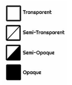
Acrylics and Oils generally have a little square on the tube telling you whether the paint is transparent or opaque. It is worth paying attention to this and the effect it has on your colour mixing and paint application. When chosen intentionally it can be used to great effect to add variety and interest in your paintings.