
FIGURATIVE PROCESS NOTES
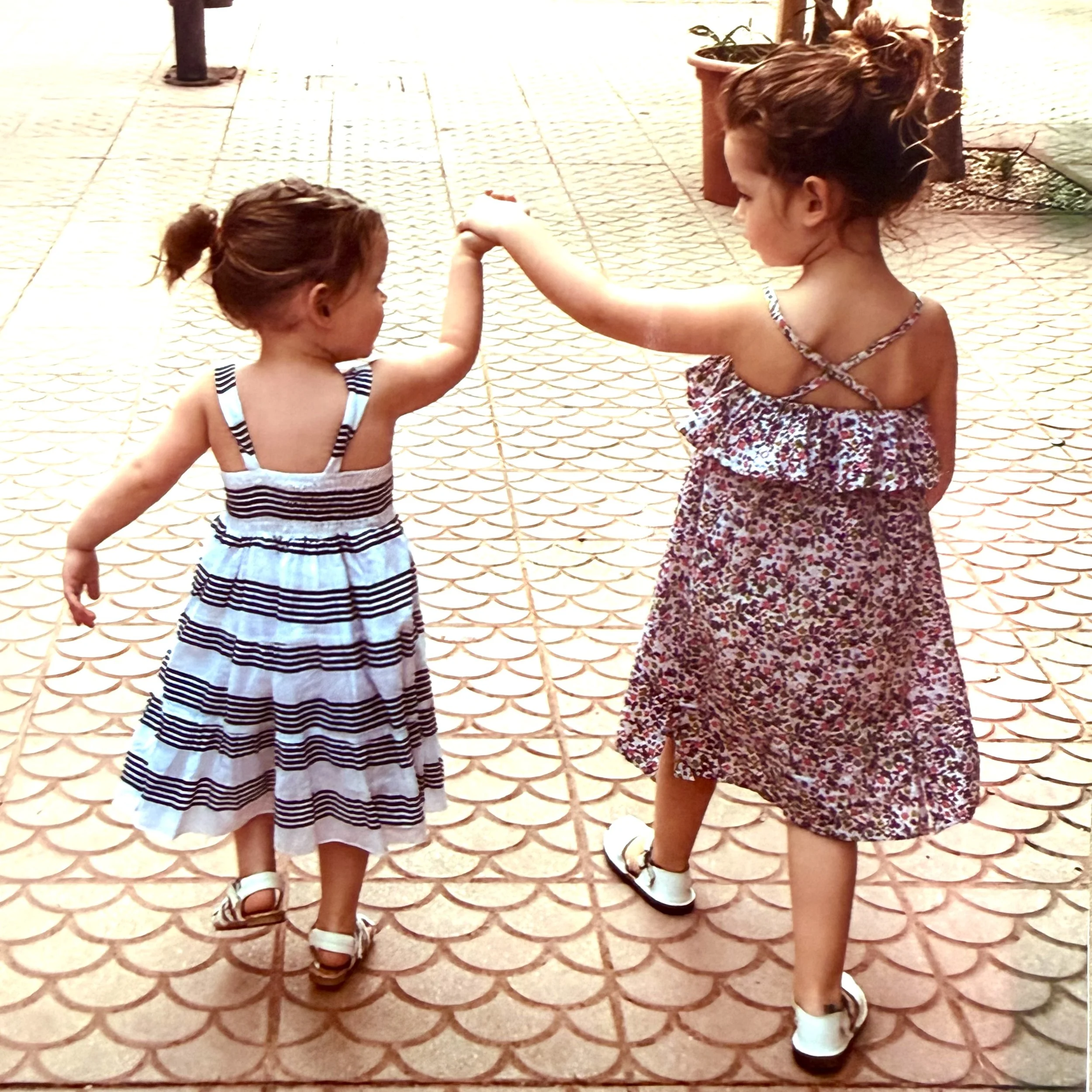
First things first - YOU NEED A GOOD IMAGE TO WORK FROM !
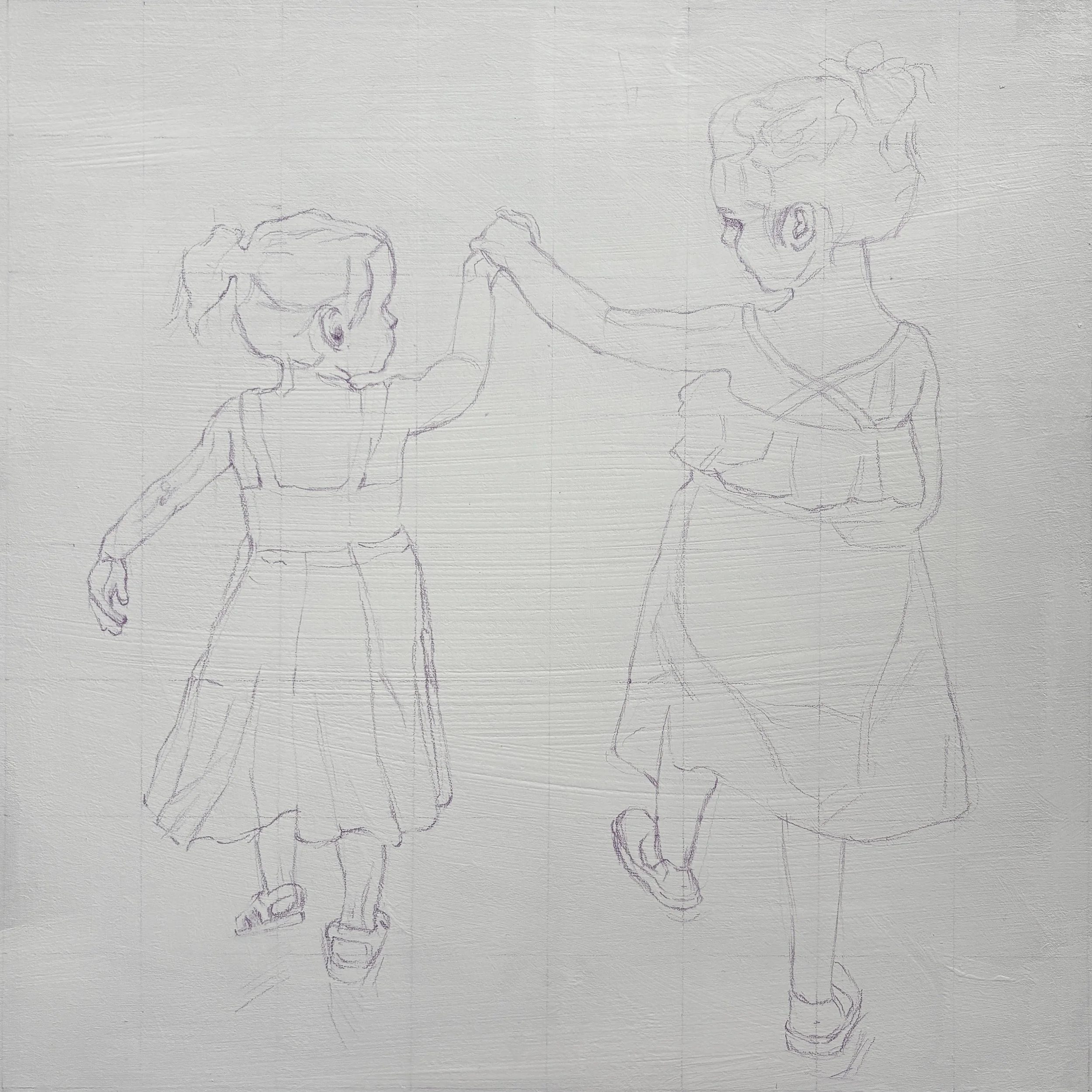
Using a loose grid to help position the figures accurately, allowing space around the edges for a slight cropping when framed.
Finding the balance of remaining ‘true to style’ verus true to the image…. Smooth photo realism is not for me, hopefully this is evident to potential clients from my gallery of work and when they then commission me to do a painting they know what to expect! Having said that, I appreciate that I am painting young children with smooth young skin so it’s quite challenge to find a happy medium. I’ve had to be hyper aware of subtle changes in tone and colour temperature otherwise it all looks clumsy. The smallest mark can make or break the likeness, it comes and goes throught the painting.
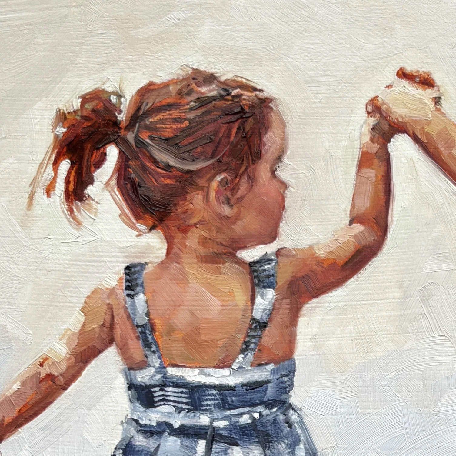
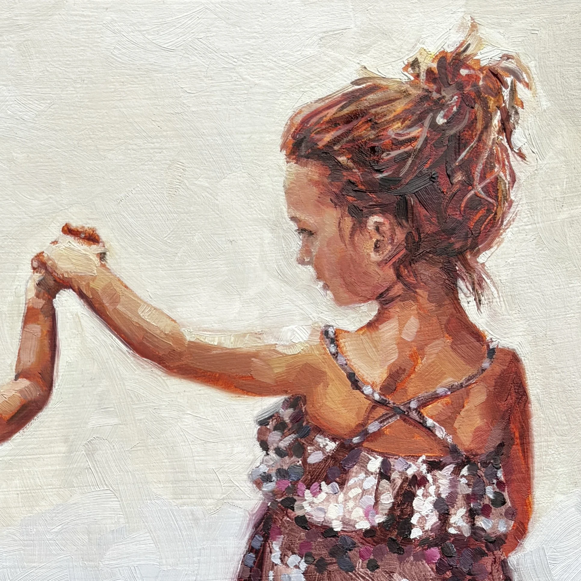
I liked the way the scallop shapes in the paving were mimiced in the arc of their arms….also how I could use the blue of the dress on the left in the bottom shoes on the right and visa versa.
I kept the colour of the tiles for the top half so that it referenced the place the photo was taken, but changed the bottom half to a cooler blue shade that would contrast better with the flesh tones and tie in with the blue dress. The pink underpainting shows through in the scallop shapes, reflecting the colour of the dusky pink dress.
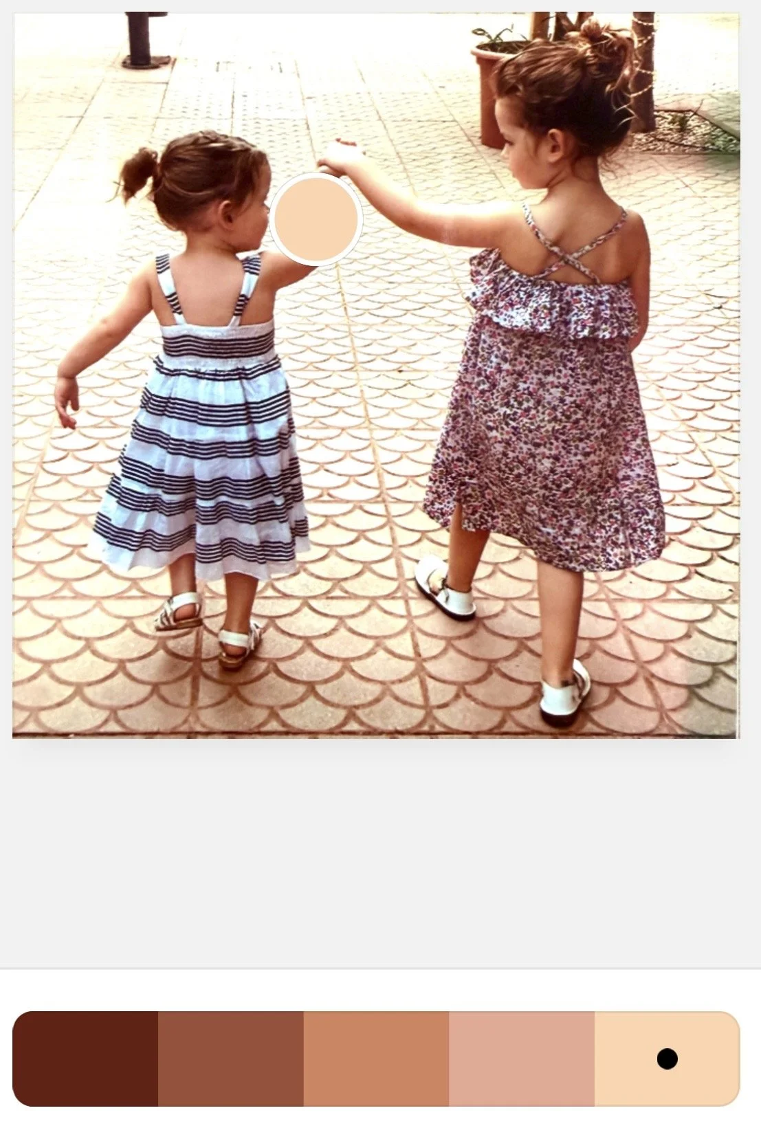
Using ‘Coolors’ to help me premix a realistic palette of flesh tones - its amazing just how dark and warm they need to be when in shadow.
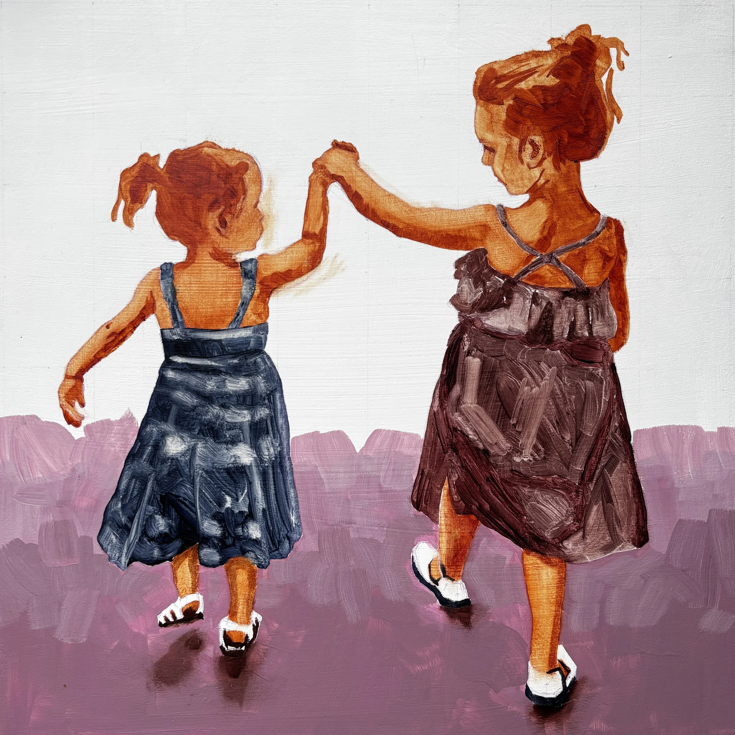
I’m a big fan of an under-painting…even 2 tones on the skin is enough to suggest 3 dimensions…
My intention is to cover most of the underpainting up- but it is not time wasted. Not only are you establishing tones - you are getting to know your subject matter, getting a feel for what’s important in the composition. It will do a lot of the work for you, if you get it right to begin with. You can allow bits of it to show through in places and scratch back to reveal it underneath. That was my plan with the dusky pink ground- I knew that if I placed a lighter colour over the top I could scratch out the scallop shapes in the tiles rather than clumsily painting them in at the end.
A lot of the underpainting of the girls dresses remained visible in the final painting- the transparent underpainting giving the impression of lightweight flowing fabric, requiring a minimal amount of patterned detail on the top layer and allowing it to remain both fresh looking and ‘painterly’.
It’s funny how certain phrases that your teachers say to you stay with you- for years!… I was in an a-level life drawing class (too many years ago to mention) … I thought I’d done a pretty decent drawing - everything was in proportion….then the teacher came and stood behind me, looked over my shoulder and said “you have caught nothing of the twist of the pose”…that stayed with me. Here, even the shadows under the girls shoes give an indication of where their weight is placed and help to show that they are walking - not static.
You can’t draw or paint the figure as a static object- it is always moving - even it if is only through breath. This is why it is so important to spend lots of time carefully working your edges- to create the impression of movement, to soften features, to capture light.
Spot the underpainting ;)
Not intentional - but I love the tiny dot of an eyelash and her left elbow! Also the ‘lost edges’ where the light spills into her arms (above).
See previous post for final painting.
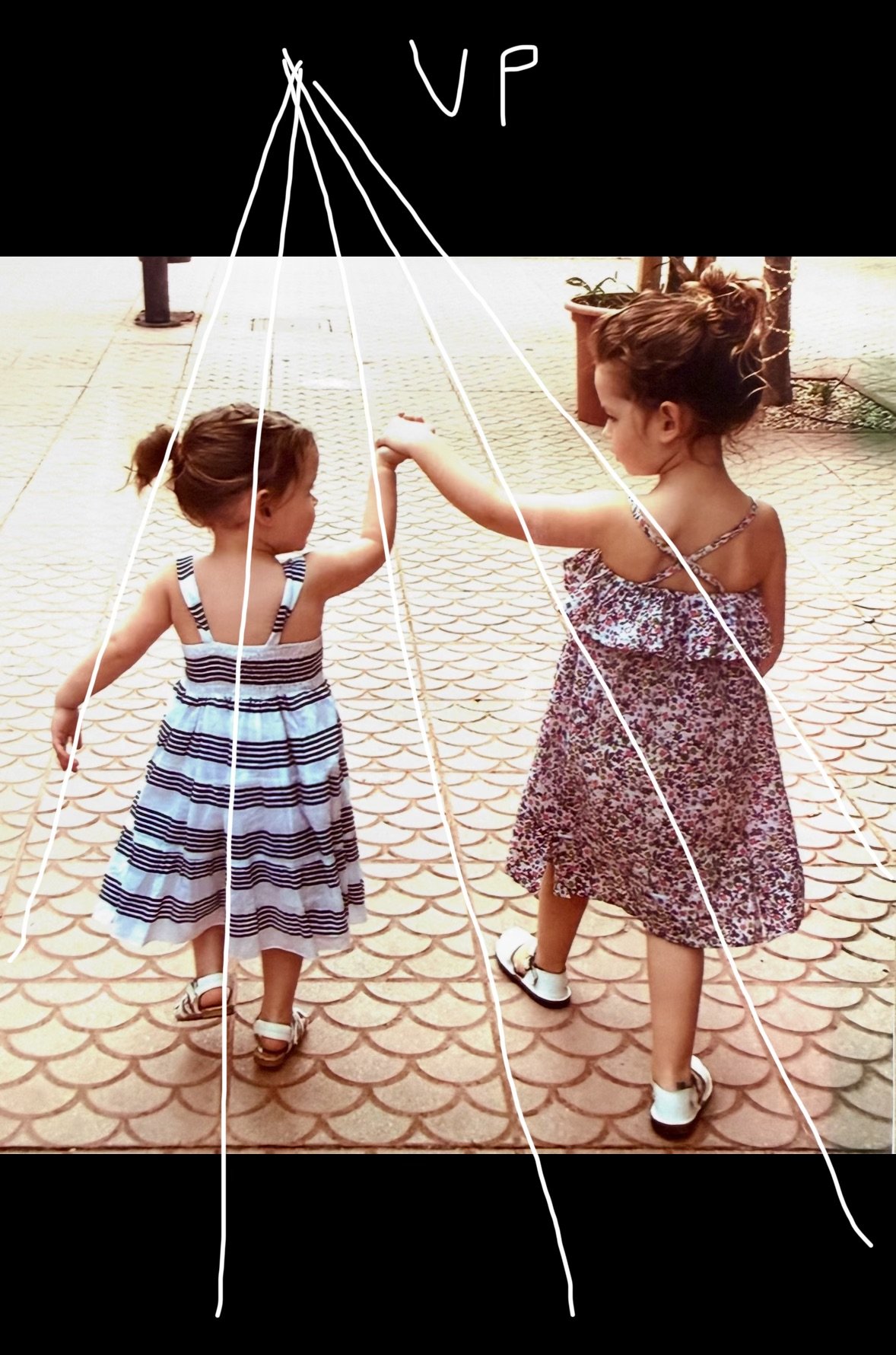
Remain aware of the ‘vanishing point’ when adding detail for the tiles. I had marks for these lines on the edge of the board so that I could reference them at the end for the converging verticals. You can see (above) that my vanishing point is off the page - but still ‘plotable’!
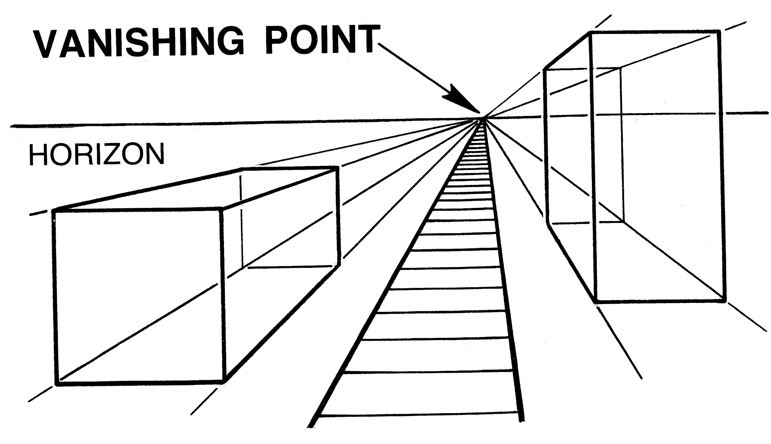
A vanishing point is a specific spot on the horizon line in a perspective drawing or photograph where receding parallel lines appear to meet and disappear. It is a fundamental technique used to create the illusion of three-dimensional depth, distance, and realism on a two-dimensional surface.
Key aspects of vanishing points include:
Placement: They are located on the horizon line (eye level).
Convergence: Parallel lines (orthogonal lines) in a scene, such as railroad tracks or road edges, appear to converge at this point.
Perspective Types:
One-Point Perspective: Features a single vanishing point directly in front of the viewer.
Two-Point Perspective: Uses two vanishing points, usually on opposite sides of the horizon line, commonly for drawing buildings from a corner view.
Three-Point Perspective: Employs three points to add vertical perspective, such as looking up or down at a tall building.
Application: Used extensively in art, architecture, and photography to guide the viewer's eye and establish depth.